Sunday, 26 April 2009

Hey Cupcake!

A quick flick through my Stampin Up catalogue inspired me to make these cards. The papers and card are all from a DCWV baby stack. To make the cupcakes Ive cut out the bottom part and embossed with my cuttlebug folder. I've inked the edges of the topping of the cupcake and have also drawn around each circle with my glue pen and then added some glamour dust, before mounting it on foam pads. I've then topped it off with a pink button. And a slight variation on the first one! I've used my scalloped edge scissors to layer the curved edge.

Boys, Boys, Boys!

I've had a few of my friends little boys to make cards for over the past couple of weeks. I wanted to have another go at my favourite little paper pieced dinosaur that I made a few months back, and here he is. This time I've used the basic grey Archaic paper set, which is what origianlly inspired me to make my own dinosuar. The little bones are all hand drawn and cut out. In all I made 4 dinosaurs which were really time consuming but quite theraputic.I had this Sugar Nellie Pirate coloured and sitting in my stamped images box waiting to be used! I had a vision of this card before I made it, and Its absolutely nothing like it was going to be! I've actually kept it a lot simpler than it was going to be. Ive distressed the edges of the map and highlighted some of the lines so they stand out a bit more. I was having a flick through some of my old magazines looking for inspiration when I came across a page of Jo Kill's paper peiced toppers, one of which was a cute little builder. I had a go and he was really easy to make. I just cut out a few circles using a punch, did a little bit of cutting and a lot of edge inking! I've also gone with Jo's style of doodled edges which I think goes well with this image. I really like making my own paper peiced toppers for cards. Its very satisfyingAnd a slightly larger version. The diy letters are little wooden stickers that I got from a pound shop ages ago. I knew they would be usefull for something one day! The wood effect squre is actually some old laminate effect vinyl which we had left over from when we had to make a repair in our kitchen. Its actually been really usefull and I've used it on a few cards in the past.

Thursday, 23 April 2009

Baby Baby!

Hi everybody! Hope you have all had a lovely week! We've had some lovely weather here and I've found myself relaxing in the summer house a few times this week! when I really should have been doing other things, but it was too nice.

Two of my friends have had babies in the last 3 weeks, a little girl and a boy and I wanted to make each of them a nice gift rather than buying something. I've made my little new baby keepsake that I've made a few times now. I made a 3 page concertina card which slides into a
wallet/envelope made from a heavy weight vellum. So here is the pink one! Actually its the first pink one I've ever made, all the others have been for boys, so it made a nice change.
I've also made a matching personalised card too using the cute Penny Black stamp. I really love this little hedgie, he's so cute!


Back Soon!

Wednesday, 22 April 2009

Tinker & Co DT Cards - Elisia Paper Pack

Here are my first few cards that I've made for Tinker & Co as part of the Design Team. The paper pack is called Elisia and you can buy it here! I really love the colours in this set, and the flowery flourish is absolutely gorgeous!
This first card is my favourite of the set. Its made using the Joy-Fold layout. I've used a combination of the three paisly papers from the set, combined with some black card. I think these colours contrast really well. The flourish element has been printed onto acetate and then cut around the edges before being fastened with a small brad through the centre of the flower. A few adhesive stones and some organza ribbon to finish and voila!

I've made this one using a sketch I used a couple of weeks ago, and have used some of the more floral papers from the pack this time. Again the flourishes are printed onto acetate and fastened with a brad.
This was quite a simple one to make, again using the blue paisley paper layered onto white cardstock with inked edges. I used my nestabilities to cut out the squares and layered over the printed flourishes so that they overlapped the square. I then just stamped the sentiment and added a few adhesive stones to finish.
And finally, using my favourite layout of the moment! I paper pieced Tilda's dress using the pink and black spotty paper, which was really quite fiddly, I'd not done this before, but I love the result so it was worth it! I love the pink & black combination, one of my favourites.


Yo can buy this kit from Tinker & Co along with a huge range of other digital kits too.


Sunday, 19 April 2009

My Favourite Layout!

I've discovered that this is my favourite layout at the moment. Every card I make using this sketch I really like, which is unusual for me! So here are a few of them. First of all is this gorgeous Edwin! I decided to use papers from the DCWV Rockstar stack, which I have been very reluctant to use in the past and it has sat in my craft room for about a year now! Its one of those sets thats too good to cut up, but I was brave and here is the result! I'm glad I used it now. The little records are so easy to make and so effective. I just cut a few small circles with my nestablities and popped an eyelet in the centre, and then just added a few white highlighted lines.
I liked the card above so much so, that I wanted to re-create a girly one using some of the pink papers from the Rockstar stack. It took me a while to come up with the idea of using the Ipod as I didn't think I had a suitable alternative to the Edwin image, until I woke up the following morning, after having made the card the night before, and realised that I have a Pink Petticoat image of Lola holding an Ipod! I will use that one next time, lol! I find the best ideas usually come after a good nights sleep, but then I have to write them down quickly before I forget! And finally, I bought these Basic Grey papers a month or so ago now, and was really inspired by the colours. I had this Edwin image already coloured and he kind of matches so thought I'd use him.


Some Great News!!! and some Thank You's!!!

I apologise for being such a bad blogger! I've been so busy over the past couple of weeks with lots of orders for my cards and family stuff, that I just haven't had the time to do any blogging, so I've set today aside so that I can attempt to catch up!

First of all I'm very proud to announce that I have been asked by Jo at Tinker & Co to become a member of their Design Team, which I am over the moon about! If you haven't come accross Tinker & Co before, please go and take a look at the products in their shop. The digital kits are just gorgeous. Also, there are some freebies for download on their blog, to get you started.
I would also like to say a big thank you to Chrissie, Helen and Victoria for giving me this award. It means so much! Thank you. I hope to get round to passing it on to 10 of my favourite blogs as soon as I am able to catch up a bit!
I will be back later with some cards to show you!

Wednesday, 1 April 2009

I've gone a bit overboard with the Urban Prairie

A couple of weeks ago, I treated myself to the Urban Prarie paper pack from Basic Grey and I really fell in love with it. Its full of very bright spring like papers. Subsequently I've made quite a lot of cards using them! First up is another joy-fold card. Not one of my best cards, but something a little different. And another view! This next card is one I've been asked to make for a lady who enjoys all things sparkly and pretty and also loves her holidays. I decided to print off this beach babe lola from Pink Petticoat. Ive had this set for a while now and never made a card with her before. I've doodled this card quite a bit. I think I got carried away! The numbers are making memories glitter stickers, they sparkle much more in real life!I made this one a few weeks back when I was having a surge of inspiration. I've used the aqua card as the base, which is not something I normally do. I usually just layer the coloured card onto a white base card (i'm stingy and dont like to use up too much of my coloured card!) but thought as this was a colour I don't use all that often that I'd use this instead.
The image is a Magnolia Stamp with a computer generated sentiment. The flower is one of my doodlebug flowers. Its lovely. All glittery and shimmering!
I was trying to make some quick mothers day cards for a couple of orders I had and already had a couple of magnolia images coloured in. The little tag sentiment is one from a free set that came with a magazine last year! I knew I would use it eventually. It co-ordinates perfectly!
And another criss-cross card, I'm really loving these at the moment. This one was made for mothers day, but can easily be changed for any other occasion as the white card can be removed and replaced. I really like the colours on this paper. Red and this turqouise seem to go really well together, I may have to combine these two again.
Finally, this is a card I made when I was experimenting the other day. I saw a card with a vellum flower in a magazine which inspired me. The vellum i've used is quite thick. I've embossed it with the swiss dots folder and then inked the edges. I'm not really sure that this was the card I intended it to be, but it works as a simple quick make!

I've been a busy little bee...I've lots to show you

First of all, my mums friend, one of my most loyal customers! asked me to make her a wedding card which matched the invitation she received. She actually gave me the invite so I could use the embellishments from it which was really handy. She specifically requested an A5 gatefold card and this is what I came up with! The picture doesnt really do it much justice, its much prettier in real life. The original invite was simple a DL sized card with the ribbon and heart shaped diamonte buckle. I wanted to make the card simple and not too fussy. I've embossed a square with my nestabilities, a new technique for me! Usually I just cut and emboss them! I then printed the sentiment from my pc and mounted using silver mirror card. I've added two strips of the same ribbon to the edge of the card and finished with a few extra adhesive stones! I dont think you can beat simplicity when it comes to wedding cards.

The same lady asked me to make another card for an 80th Birthday, she wanted it to be quite simple with butterflies and flowers. I had a rummage through my stash and I pulled out this beautiful paper, by Laura Ashley. This is one of my favourites, I absolutely love the colours.
I've added some glamour dust to some of the butterflies for some added sparkle. I decided to make the sentiment the main feature of the card instead of sticking something else on and ruining it. I printed it from the pc and layered it using my trusty nestabilities, adding a few adhesive stones to finish it off. This has got to be one of the quickest cards I've made! I hope she likes it as much as I do.
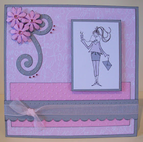
Here are a couple of cards I made using some Pink Pettticoat Images. I love these Lola images! I'd actually had this one printed off for a while, so thought it was about time I made good use of her. I really love this combination of pink and grey.
And this one, I'm not sure about. I love the papers and the colours, but something about it just doesnt feel right. Its a sketch I've used on a few of my cards and they have all looked ok, but it doesnt seem to work her. The papers are from the Basic Grey Urban Prairie set. I've added some glamour dust to finish it off.
And the last pink petticoat card! I think this is my favourite of the three, I have used my quickie glue pen and glamour dust to highlight some of the flourishes on the paper. The sentiment is printed from my pc using the "Sparkly" font from Fontfinder.com
I've added quite a bit of glamour dust to lola and to the sentiment too.
I've made another stationery box for the lady who ordered the first two card as a thank you gift. Again, I've made a matching criss-cross card to go with it.
The only problem I've discovered when making the stationery boxes is that I've made A6 sized notecards to go in the back section, only I can't fit the envelopes in, they are about 1cm too big! So before I make the next one I have to resize the cards and find envelopes to fit! For now though she can have a pack of envelopes seperately!

I'm really pleased with how these have turned out. The box itself is very quick to make, its the contents that take the most time.
Right, I think thats about all for this post. I will be back soon though as I have more cards to show!
The sun is shining here today, and it feels quite mild too, so I'm off to make the most of it before it goes again.
Hope you all enjoy your day.